News - Improving your Emails and delivery rates

They say there are 2 things guaranteed in life and one of those really should be changed from "Taxes" to "Change". Yes things change all the time and you can definitely guarantee that!
It is said that one of the major contributors to success in life is the ability to adapt to that change. In the business world this means continually being able to stay in touch with what is going on and making sure that you either stay ahead, or at least move with it.
Over the last 21 years we've been constantly evolving our products to meet our clients needs. Here's some of the latest "Changes".
Email Security
OK, so this is nothing really new, but if you want to ensure that you're emails stand the best chance of getting delivered and in someones inbox, then you MUST get your DNS settings right. DMARC, SPF and DKIM are no longer optional. If you havent sorted these yet, or are not too sure, please call our support team on 1300 132 739 so we can help you. There is no point in sending emails out if no-one is going to get them, or read them!


Responsive Templates
For those that have either not heard this term, or are not too sure what it means. Responsive simply means that the resulting email layout will "respond" to the device that is being used to view it and attempt to display the email in the best form for that device. If you look at your PC screen you probably have a bigger display than on your mobile device. Hence you can fit more on one line on your PC. So a responsive template will display differently on each of those devices. A standard template will retain its layout, irrespective of the device that is being used to view it. It all depends on your design brief and what you want to portray.
Typically a responsive template will be restricted to 612 pixels wide, as you can see with this email. This is the optimum width for a responsive template.
You will note that when you go to create your emails via our website, that there is a new tab called "Responsive Templates". Although these are basic layouts right now, we are in teh process of adding a range of new templates for you to choose from.
Recent surveys tell us that well over 50% of emails are read on mobile devices these days, so really all your emails should use responsive templates now.
Mobile Preview
You will notice that when you go to preview your HTML build, that there is now the option to view what it will look like on a PC and on a mobile device.
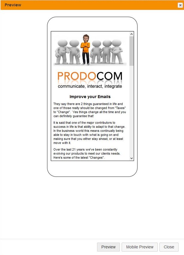
MOBILE PREVIEW
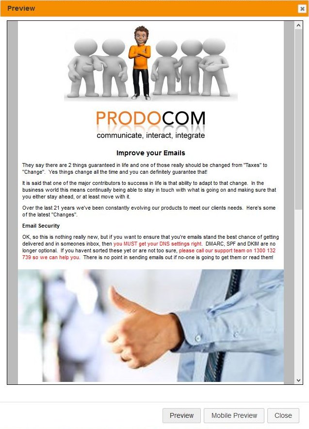
PC PREVIEW
Email Pre-header
This is a relatively new term. When you view your emails in some email solutions, they will display who the email has come from, the subject line and then either a "pre-header", and/or the first line of the email body text. If you want to ensure that what gets displayed matches what you want people to see, then you can now set a pre-header in the Email HTML online builder. Simply Select the pre-header option in the setup stage to be "yes" and type in the text you want to display.
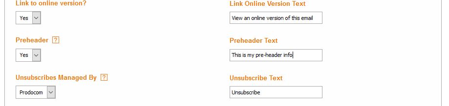
ADDING PRE-HEADER IN THE SETUP PAGE
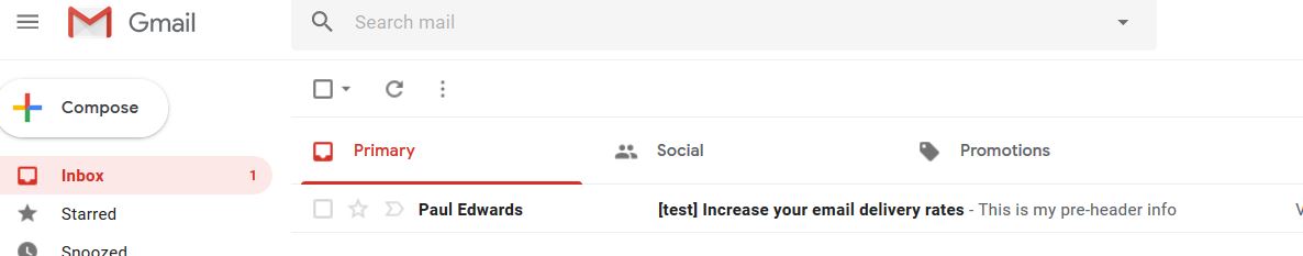
HOW IT APPEARS IN GMAIL
Insert Buttons
We've now made inserting buttons into emails easier. Simply select wher you want the button, click on the button icon  in the builder menu and enter the desired options.
View online and unsubscribe options
The PRODOCOM system automatically inserts a "View online version of this email" link at the top of your email and an "Unscubscribe" link at the bottom. If you want to move these links to being elsewhere in your email, go to where you want the link to be, click on the insert special link option in the Email HTML builder  and select the appropriate options.